Conference Room Layout Examples
A conference room’s layout is an important element in making sure that the room works well for meeting participants. If you are planning one or more conference room layouts, you’ll want to think about the goals for each room, learn the typical items with which to furnish a conference room and check out the most common layouts.
Read More
Goals for a Meeting Room
For each conference room you are designing, one of the first steps is to think about your goals for the room. First off, what is the expected headcount for typical meetings in the room? For example, is the room for team meetings of 2-6 people, or for larger team meetings of, say, 20 people? Some conference rooms are used for training sessions, while others might be for luncheon meetings. So, it’s a good idea to think through the uses and goals for each conference room first. Be sure to also consider accessibility, such as making sure there is enough space for a wheelchair user to navigate the room, and what equipment to install to make sure the room meets the user’s needs.
Standard Equipment
Depending on your goals for each conference room, the furnishings and accessories can vary. Here are some of the most common items:
- One or more tables, and chairs
- A credenza for holding room supplies. On top, you’ll often find a coffee maker and/or hot water carafe
- Some meeting rooms may have an under-counter fridge for cold drinks
- A whiteboard or interactive Smartboard
- A video display system with a large computer screen, television screen, or projector
- Audio or video conferencing equipment
Common Conference Room Layouts
It’s a good idea to understand the four most popular layouts for meeting rooms. This should give you a good start and then you can customize the floor plans for your particular needs.
Standard or Boardroom Layout
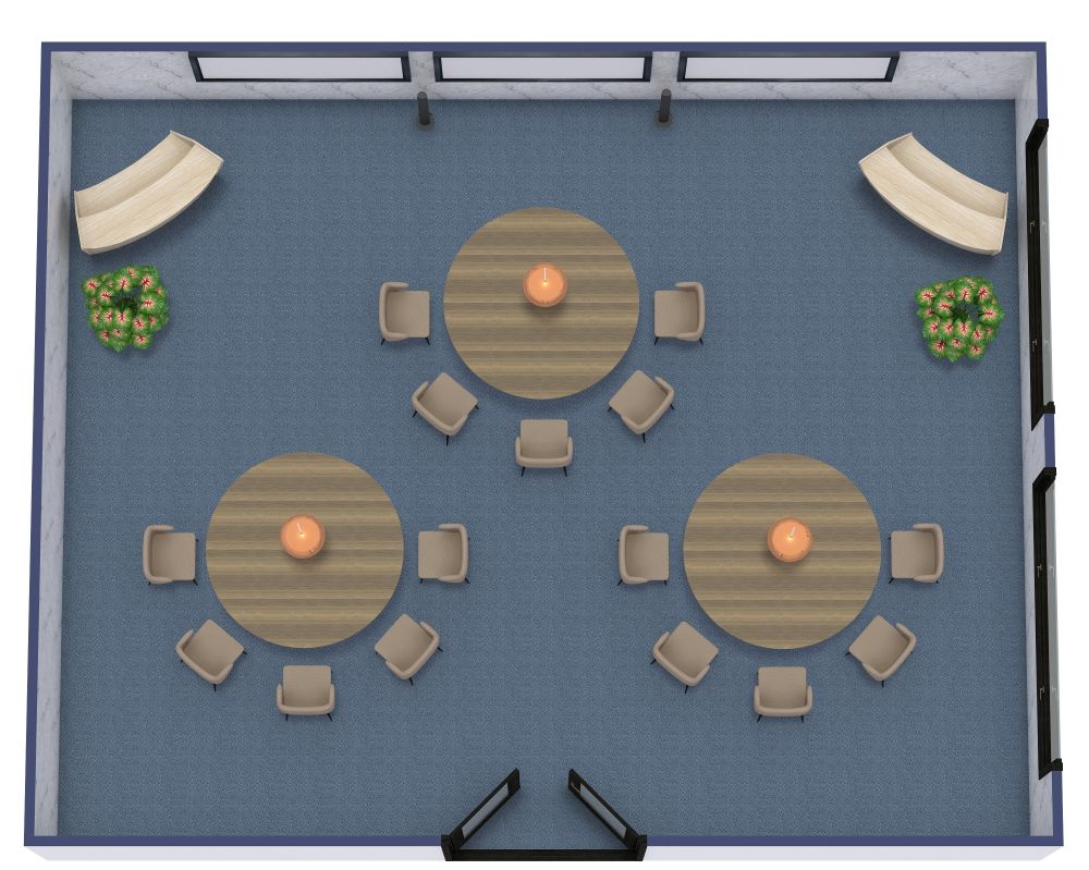
A standard, or boardroom layout is probably the most recognizable meeting room setup. It includes a rectangle, oval, or round table in a room. There may be a credenza along one wall for supplies. Depending on the room’s goals, it may include a whiteboard or TV screen mounted on a wall.
This type of room and layout has a wide variety of applications. For example, in a small size room, you’ll often see a round table and chairs set up for 2-6 person team meetings. On the other hand, this standard layout may also be used in a room designed for important board meetings - in this case, the room may include high-end decor and a long rectangular table seating 20 or more.
Some considerations for a standard or board room layout: a round table allows meeting participants to easily see each other and promotes everyone having an equal voice. This is a great setup for team meetings. If you are creating a layout for a larger meeting room, think about where the person running the meetings will sit or stand. You may want to create a visual focal point at that location.
U Shaped Layout
A u-shaped layout places 3 rectangular tables in the shape of a U. This layout works well for a training room or larger team meetings where a presenter will be at the front of the room. A benefit to this layout is that no one will have their back to a whiteboard or TV screen.
Auditorium Style
If you often host informational-type meetings, guest speakers, or panelists, you may want to set up a conference room in the auditorium (theater) style. In this case, you’ll lay out rows of chairs facing the front of the room. This floor plan is space efficient as there is not a table in front of each participant. There may be a podium or table at the front for the speaker or panelists. The front wall may have a large screen or whiteboard.
Classroom Style
Classroom style is similar to auditorium style, except that there is a table in front of each row of chairs. This layout works well if meeting participants need to use laptops or take notes during meetings.
Layout and Room Size Tips
Don’t try to cram too much into a conference room layout, or it can feel crowded and you’ll have people tripping over each other. It’s a good idea to allocate close to 3 ft (about 1 meter) per seat and ideally 4 ft (or 1.2 m) between the table ends or seatbacks and the walls. In general, a small conference room is around 150-200 sq ft (about 15 - 20 m2) and can usually hold 2-8 people. A medium conference room is from 200-300 sq ft (about 20-30 m2) and holds from 8-16 people. Finally, a large conference room is from 300 sq ft and up (about 30 m2) and holds 16 or more meeting participants.